Names of Demons from Collin de Plancy’s ‘’Dictionnaire Infernal’’, 1818.
Names of Demons from Collin de Plancy’s ‘’Dictionnaire Infernal’’, 1818.
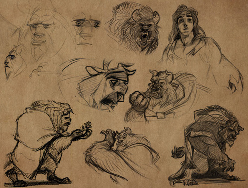
Okay, I find myself with time to do another tutorial! There was a pretty large number of requests for faces, so I’ll do that one. I’m always anxious when I make these tutorials, but since you guys seemed to react positively to the hand tutorial, I’ll try again!
Anyway, insert my usual disclaimers here: Art is subjective, so I am in no way saying that my way of doing things is the best way. This is just how I personally approach the drawing and designing process. I won’t draw a bunch of faces for you to copy, but just talk about things I’ve observed and think about while I draw.
~
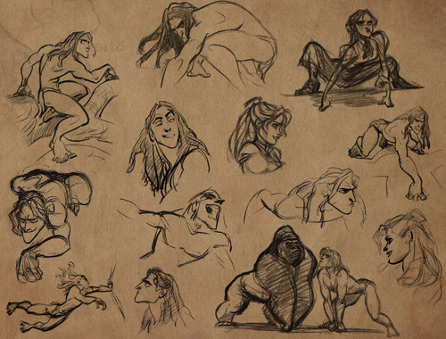
Faces! Phew.. I don’t even know where to START. I’m going to assume that we all know the anatomy of a face, what with the fact that we all have one and stare at other people’s faces.
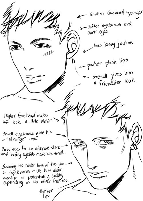
But, for the sake of saying it: all faces are made up of the same things, but if you tweak even one feature, you can change the way a person’s face looks. Often, if a character doesn’t look right, all I have to do is change one little thing (make the nose a little smaller, make the eyes a little larger) and suddenly they look the way they are supposed to. So keep in mind when you are drawing a character how you want their features to be.
For example: Do they have a round nose or a flat one? Do they have round eyes or narrow? Do they have large ears that stick out a bit or little ones? Are their lips full and pouty or thin? Is their lower lip bigger than the top? Is their jawline strong or delicate? These are all things to consider and will greatly effect how your character looks.
Faces that have smoother curves tend to look younger and more feminine. While harder lines and square jaws lean towards a manlier face.
~
Every little feature in the face can be altered in major or minor ways. So it’s a little hard for me to explain every single one of them.. The problem is, while a feature, all on it’s own, can have one result. When you combine it with the rest of the features of the face, it can have a completely different effect. For example, lets start with lips.
When lips are soft and plush (this is for both guys and girls) it can have two different results. It can make a character look young and innocent OR it can make them look totally sexy and kissable. It depends completely on the rest of the character’s features.
So keep that in mind throughout the tutorial. Mixing and matching features will completely change the personality that comes across through the character’s face. Obviously, it all depends on the look you’re going for.
~
Eyes. There are all types. I’ll admit that I have certain standard types of eye shapes that I stick to, but there are all sorts of subtle variations that you can try. I’m not going to draw them all out for you, but here are some tips!
Narrow eyes can be used for asian features, but, they also can give a character a less innocent look. The narrow, slender eyes give someone, I think, a more keen intelligent and sometimes sneaky look in drawings. While larger eyes tend to remind us of things like puppies and deer with there big sweetness.
This isn’t always true of course, and it’s fun to purposefully do the opposite, like make a sneaky evil character with a sweet face. I’m just saying that’s what those types of eye shapes typically make us think of.
Eyes can also be difficult because the shape of your eyes will change depending on your expression. This makes continuity in comics particularly difficult, but not impossible, so long as you remember the basics of the shape you chose.
And don’t forget the anatomy of the eye either. Eyes are located in deep round eye-sockets. And the eye itself is also a sphere (not flat!!). This is something more prominent when drawing a profile, but it’s still there any time. The area beneath your eyebrows and around your eyes is full of little dips and lines. You dont have to draw them all, but I like to show hints of this part of the anatomy. It adds character to your image, and helps define the character’s face. Such as, some characters having more sunken in eyes and heavy lines beneath their eyes, some characters having very low eyebrows, and some having prominent cheekbones. Things like that.
~
When angry, the face crinkles up. (Your face will also crinkle for other reasons, like if you smell something bad or are feeling annoyed) So if you want a character to look really angry, remember that your eyebrows draw together, your nose wrinkles and eyes narrow. This creates a whole mess of lines around your forehead/between the eyes.
~
And also, just a note on general anatomy of the head. Although things will vary from person to person. This is the GENERAL proportions of the face. I say -general- because everything is different for everyone. Some people have eyes close together, or far apart. Some people have longer noses, some have tiny noses. Some people have wide lips and other’s small. Some people have high foreheads, some people have sharper chins. The face is hard to give a tutorial on because there is SO MUCH VARIATION. But, like I said, this is the general anatomy of the face.
I hope you found this tutorial useful! I’m sure there was more that I could have covered, but it’s a little hard to think of everything… Anyway! Enjoy~

Emoji Challenge Vr. 2.
Let’s do this! I need to get my rusty hand to work ❤
I’m ready, send some emoji/character choices my way!


It’s a two-fer! Courtesy of @dcwomenkickingass, and specifically this post, I had to do an edit of these, while my storyboards wait.
I’m not going to go into long explanations here, I hope the drawings do speak for themselves. In the first case, it’s a Land being Land, although I do have to say that he did give a butt to Silk, as opposed to his usual ablation of hips and gluteus maximi. However, he unfortunately did it wrong.
Artistic anatomy is all about drawing structure, from the inside out. Your muscles by themselves can’t look right if they aren’t placed on top of a properly proportioned skeleton. Boobs won’t look right if they aren’t drawn as following the curve of the ribcage, its center line, or the movement of the arms which either pull or push on the pectorals on which the breasts hang. The arms back mean the shoulders are lowered, and the angle of the hands will be different since there’s a ¾ turn on the torso. It shows that Land is drawing by guessed shapes, copied contours and practiced repeated motions. There’s no real structure underneath his shapes.
And if we look at the legs, I can only picture Kitty Pride phasing out of a wall: the legs look like they got mangled up to look like stumps. But even structure-wise, there is no thought put into whether the pose actually works, which is why it looks so clumsy. The legs should be reversed due to the line of action that’s in the torso but not followed through into the pelvis and legs. And I’ve been using the coil technique a lot in order to make my volumes work – it should be obvious by the roughs above – which help me figure out things like foreshortening.
Silk too was a problem of lack of structure, proportions all over the place, and lack of weight and purpose, but it felt moreso than Spiderwoman. I used the same pose Land did but worked out the skeleton first, using rotation arcs in order to properly proportion the length of the various limbs. I don’t know these characters and I might not have used these poses, but Silk here definitely looks like she’s dancing.
The variant cover by Manara looks like a pose right out of porn, pelvis up and cheeks spread, costume looking like body paint, and it makes me very uncomfortable. She doesn’t look like a superhero about to strike, she looks like she’s about to get… well, it’s a porn pose. This is sexualisation. It also reminds me of the Dog Bone sexy shape.
So I turned the pose sideways to figure it out, and to see what would work better. The sideways pose as is, as you can see, is angled to do quite the opposite of ass-kicking. Were she to try to leap from that pose, she’d fall flat on her face. The second pose is the “coiled like a spring”, but in the camera angle of the cover, it’s an ugly, ugly pose. So I tried to do something in-between, and just by making the pelvis horizontal and lifting the torso off the ground, I’ve managed to move the center of gravity so her weight is on her feet instead of her knees, she can use her arms to maneuver in most directions, and you still get an interesting body shape to look at. I think this works better, and much more ready to spring into motion.
Wanted also to say thanks for all the reblogs, likes and recent follows! I appreciate each one of them, and it’s because you’re still sharing and commenting that I came back to do this. However I’m still really busy! I won’t be posting a lot, but I do plan on posting more than I have. Back to storyboards for me!
Great breakdown of both Spider-Woman covers by Kanthara from Less Tits n’ Ass, More Kickin’ Ass (which I strongly recommend as a follow for people who like redlines/redraws/fixes). 😀
First off, I gotta start off with the typical Disclaimer.
*ahem*
This is a tutorial based off of MY knowledge and MY experience. My advice is just that, advice, and is not is anyway, shape or form, absolute. I am still learning and do not consider myself a professional or expert. Look at other sources, look at other materials, expand your inspiration, don’t just look at this tutorial and call it good. And most importantly have fun~
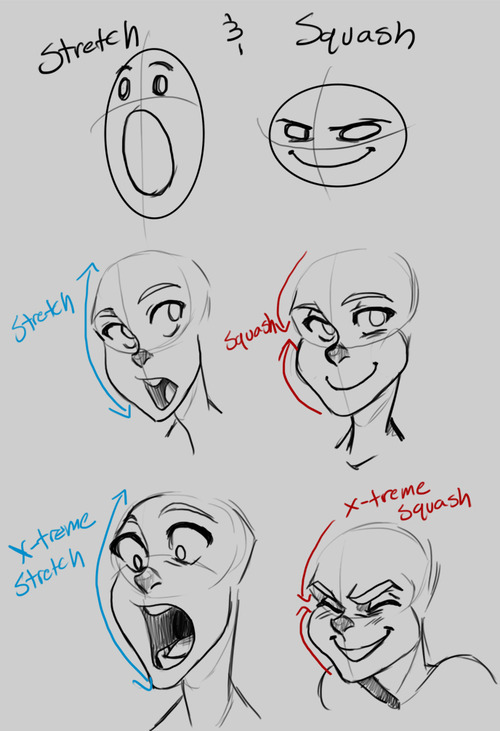
Alright, with that out of the way, before I can get to the actual expressions, we need to discuss an important concept known as “Squash and Stretch.” You’ve probably heard of it before. Squash and Stretch was a method that was invented (I use this term a bit loosely) by Freddie Moore, a Disney animator from the 1930s to 1940s. He was the animator for the Dwarves in Snow White and he gave these characters a spongy flexibility that made them feel more real and gave pliability to the face that made them come more alive.
Even outside the world of animation, Squash and Stretch is essential and you’re going to squeeze much more life out of your characters if you understand and are willing to push the weight and flexibility of their faces. This also doesn’t only apply to cartoons, look in the mirror and make funny faces and strange expressions and you’ll notice how squishy your face is.
The next concept to be aware of is the Acting Elements of the Face. This is a concept I never really thought about until I read Tom Bancroft’s Character Mentor, a book I have recommended many times. The Acting Elements are the basics of character expression and focuses on breaking down the elements of the face in order of importance to properly communicate an expression to the audience. These are not set in stone and a lot of times their order can be switched around depending on the expression. This is the default order Bancroft uses in his book:
1) The eyes
2) The eyebrows
3) The mouth
4) The neck
5) The nose
I’m not going to go into much detail about this; otherwise this tutorial will run on forever, so DEFINITELY give Character Mentor a look for a better understanding.
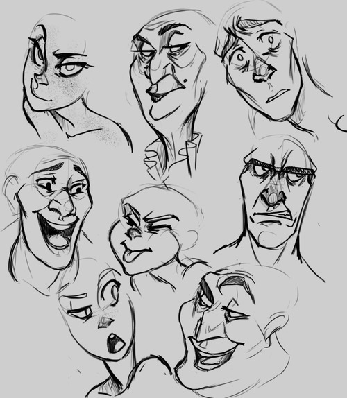
Here are some expressions I whipped up, notice the different ways each of the above elements contributes to the overall expression. Try to identify which element is strongest in each one. Also notice how some elements repeat (such as the use of the eyebrows in the bottom two) but they’re still different expressions.
I personally find that I always build from the eyes out when building an expression. Ever heard the phrase “The eyes are the windows to the soul?” well guess what? THE EYES ARE THE WINDOWS TO THE SOUL! This is why people look away when their embarrassed, why their gaze shifts when they’re lying, why their eyes grow wide in awe. It’s what makes a hero seem cold when they hold their gaze at the display of heartless behavior or gives a villain a moment of redemption when they turn away from a cruelty.
Part of the reason why Glen Keane’s characters are so incredible is the way he expresses a character through their eyes. He says “If you’re going to make a mistake, don’t make it in the eyes. Because everybody’s looking at the eyes.” He creates these characters that are filled with passion and before that passion translates into body language or into an expression, if bursts out through the eyes.
Remember when I brought up that the order of the Acting Elements is flexible? As I said, I tend to start with the eyes when expressing and character but sometimes that just doesn’t “work” with the character. Take a look a Max, from Cats Don’t Dance (if you haven’t seen the film, I highly recommend it, even if just for the animation). His face is almost ALWAYS in the same position, with the same expression, completely stiff. The only thing that moves is his mouth and it’s animated in a way that is both comical and intimidating! This is a common theme with his character, fluid motion against unmoving bulk. It contrasts and guess what? Contrast creates interest! <——Remember this phrase, because it applies to everything!
Next, pushing your expressions. Don’t be afraid to add that extra “umph” to a characters expression. Unless you’re animating, you don’t have the luxury of constant motion and steady frames, so make the most of a scene, make it clear to your audience what your character is feeling. Check out some of these simple examples below.
Now some of you probably thought the first expression was better than the second. And you know, you may be right! Sometimes a subtler expression speaks volumes more than a more obvious one. It’s important, however, to understand to how to make the most use of your character’s face. But in the end it all boils down to the character. Which leads me to my final segment of this tutorial…
A character should express themselves through their emotions. Just like costumes, colors, body language, etc. expressions are ultimately a tool used describe a character, to visually tell a story about them. When dealing with different characters, try to avoid “recycling” expressions, ESPECIALLY in the same scene/picture/moment. A good exercise is to draw two or three different characters with the same emotion but give them different expressions.
Or better yet, draw them reacting to the same situation.
Your goal should be to make each expression true to the character. Their expressions should tell the audience something about them. The same way you might bold a word or phrase to emphasize its meaning, a character should express themselves in ways that emphasize who they are.
First off, I gotta start off with the typical Disclaimer.
*ahem*
This is a tutorial based off of MY knowledge and MY experience. My advice is just that, advice, and is not is anyway, shape or form, absolute. I am still learning and do not consider myself a professional or expert. Look at other sources, look at other materials, expand your inspiration, don’t just look at this tutorial and call it good. And most importantly have fun~
Alright, with that out of the way, before I can get to the actual expressions, we need to discuss an important concept known as “Squash and Stretch.” You’ve probably heard of it before. Squash and Stretch was a method that was invented (I use this term a bit loosely) by Freddie Moore, a Disney animator from the 1930s to 1940s. He was the animator for the Dwarves in Snow White and he gave these characters a spongy flexibility that made them feel more real and gave pliability to the face that made them come more alive.
Even outside the world of animation, Squash and Stretch is essential and you’re going to squeeze much more life out of your characters if you understand and are willing to push the weight and flexibility of their faces. This also doesn’t only apply to cartoons, look in the mirror and make funny faces and strange expressions and you’ll notice how squishy your face is.
The next concept to be aware of is the Acting Elements of the Face. This is a concept I never really thought about until I read Tom Bancroft’s Character Mentor, a book I have recommended many times. The Acting Elements are the basics of character expression and focuses on breaking down the elements of the face in order of importance to properly communicate an expression to the audience. These are not set in stone and a lot of times their order can be switched around depending on the expression. This is the default order Bancroft uses in his book:
1) The eyes
2) The eyebrows
3) The mouth
4) The neck
5) The nose
I’m not going to go into much detail about this; otherwise this tutorial will run on forever, so DEFINITELY give Character Mentor a look for a better understanding.
Here are some expressions I whipped up, notice the different ways each of the above elements contributes to the overall expression. Try to identify which element is strongest in each one. Also notice how some elements repeat (such as the use of the eyebrows in the bottom two) but they’re still different expressions.
I personally find that I always build from the eyes out when building an expression. Ever heard the phrase “The eyes are the windows to the soul?” well guess what? THE EYES ARE THE WINDOWS TO THE SOUL! This is why people look away when their embarrassed, why their gaze shifts when they’re lying, why their eyes grow wide in awe. It’s what makes a hero seem cold when they hold their gaze at the display of heartless behavior or gives a villain a moment of redemption when they turn away from a cruelty.
Part of the reason why Glen Keane’s characters are so incredible is the way he expresses a character through their eyes. He says “If you’re going to make a mistake, don’t make it in the eyes. Because everybody’s looking at the eyes.” He creates these characters that are filled with passion and before that passion translates into body language or into an expression, if bursts out through the eyes.
Remember when I brought up that the order of the Acting Elements is flexible? As I said, I tend to start with the eyes when expressing and character but sometimes that just doesn’t “work” with the character. Take a look a Max, from Cats Don’t Dance (if you haven’t seen the film, I highly recommend it, even if just for the animation). His face is almost ALWAYS in the same position, with the same expression, completely stiff. The only thing that moves is his mouth and it’s animated in a way that is both comical and intimidating! This is a common theme with his character, fluid motion against unmoving bulk. It contrasts and guess what? Contrast creates interest! <——Remember this phrase, because it applies to everything!
Next, pushing your expressions. Don’t be afraid to add that extra “umph” to a characters expression. Unless you’re animating, you don’t have the luxury of constant motion and steady frames, so make the most of a scene, make it clear to your audience what your character is feeling. Check out some of these simple examples below.
Now some of you probably thought the first expression was better than the second. And you know, you may be right! Sometimes a subtler expression speaks volumes more than a more obvious one. It’s important, however, to understand to how to make the most use of your character’s face. But in the end it all boils down to the character. Which leads me to my final segment of this tutorial…
A character should express themselves through their emotions. Just like costumes, colors, body language, etc. expressions are ultimately a tool used describe a character, to visually tell a story about them. When dealing with different characters, try to avoid “recycling” expressions, ESPECIALLY in the same scene/picture/moment. A good exercise is to draw two or three different characters with the same emotion but give them different expressions.
Or better yet, draw them reacting to the same situation.
Your goal should be to make each expression true to the character. Their expressions should tell the audience something about them. The same way you might bold a word or phrase to emphasize its meaning, a character should express themselves in ways that emphasize who they are.


Photo Dump, tentatively titled: Female powerlifter goes wedding dress shopping. This was the dress that I liked the most 😊
I brought my one gym friend Terri and my mom.
nina, this will be u on ur wedding day