ok to start i have two of the same pictures of my girl Bel!
The left Bel is coloured completely on a normal layer, me picking the colour i want and slapping it on, each colour is straight from the colour wheel.
The Bel on the right is painted on a Hard-Light layer, this is the layer on normal right now. but i chose the colours while drawing with the layer in hard light as ill show you below the difference this makes…
just for comparison sake both images are with hard light on the coloured layers. the Bel on the right is how i coloured the image to get the colours how i want them to be. I colour the hard light layer as close to as how I would colour her on the normal layer as i possible can. Since i put the ‘normal’ Left image in hard light as well you can see the clear difference, the left image is far more washed out and pale.
The left bel isnt worse because of this! this is up to preference entirely, i usually use the right image’s method when i want to colour with vibrant highlights, its almost as if im colouring the shading first. the left image is far more suited for shading as shown below…
The shading and highlight layer is completely a hard light layer aswell.
Now here i where you can really tell between the two, the images convey two completely different moods now, the right bel seems to be more of sunset on a very hot day, and considering what shes wearing this is the final image i would use, the left bel is a lot cooler, i used a stronger blue/purple here to show the difference clearly, but even with a more subtle blue it would still be a cooler image, maybe a partly cloudy day.
The main point of showing this is that again if i use the right image method of colouring, i would focus mainly on highlights as the base colours are much darker. and on the left i would focus on shading as the base colours are much brighter, simple 🙂
and for the sake of it here’s the highlight/shade layer in block colours to show you what i mean.
I hope this helped any! I’m super bad at explaining stuff like this so at least the images make sense? if you have anymore questions my ask box is open 🙂
I’M GONNA TRY MY BEST TO EXPLAIN THIS because, man i feel u but at the same time I know very little about the technical anatomy when it comes to skulls ;;
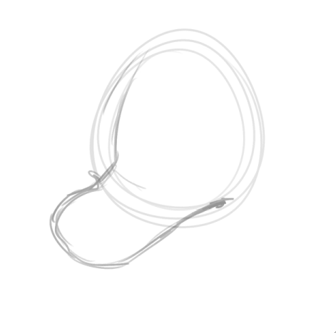
Let’s do a sorta above ¾ view for this rlly quick, when I start out, I always like to establish one part of the snout at a time, instead of trying to just DIVE RIGHT IN. So I start by putting vague upper muzzle shapes here, just to get the direction goin’
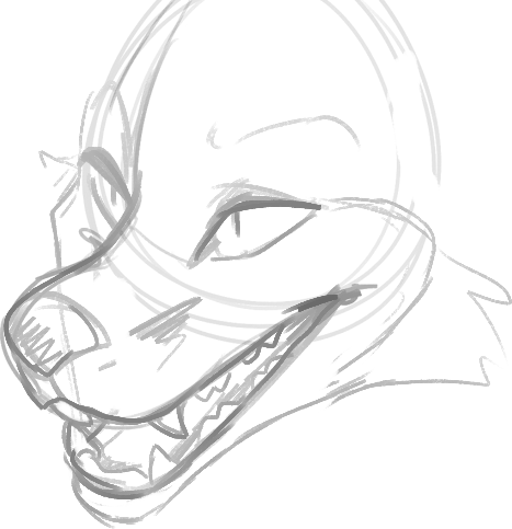
NOW WE GOTTA GIVE THIS THING A LOWER JAW to help keep it symmetrical, I like to pull the lines from the corners of the upper lips. DON’T BE AFRAID TO OVERLAP, OVERLAPPING IS IMPORTANT IN GENERAL BUT ESPECIALLY WHEN DRAWING OPEN MUZZLES LIKE THIS!! See that line that goes from the upper right corner of the lip and through the top half of the muzzle? I basically use that as my guide to keep from pulling the jaw too far out, or too far in. Don’t worry if it looks a bit like they have an underbite either, depending on the angle, perspective will do that..it likes to fuk with ur brain a bit
OKAY NOW we’re bringing back the overlapping line because chins are still hard for me to draw and I change how i do it constantly but this is a good method to get a chin that doesn’t thrust too much outwards or inwards (unless that’s the specific jaw shape you were going for with ur character, then by all means do so!!! ) bring the line from the further corner of the eye, form the cheek, and bring it down (overlapping over the top jaw as we are wont to do) and bring it AROUND TOWN. You see here that it’s kinda boxy and I could probably curve that line some more to give a more slender look but w/e IT WORKS WITH MOST SHAPES
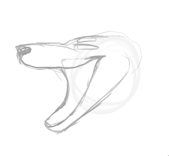
if you’re referring to something like the BND draw I posted recently, it’s pretty much a similar course of action, so let’s use this asshole as an example because his mouth is obnoxiously wide when it’s open
Start off with the upper jaw, again, it’s easier to piece these things together vs trying to shove all the shapes together at once (for me it is anyways)
i’m doing this from profile view this time but you can see the overlapping lines still work!! I roughly places where the otherside of the upper corner of the lip would be on the side we don’t see and used that to help me get an idea of how far down the lower jaw is gonna go~! Don’t worry, it’s gonna look awkward most of the time and it’s a perfect chance to go in and fix the length of the upper/lower jaw before you start adding in deets like the tongue and teeth! <:
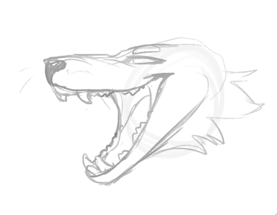
there we go!!!! looks a lot less awkward LOL
you can also do something like this if ur feeling kinda toony (it’s really fun, simple yet effective!)
It can work for a lot of different styles, from realism to toony to my stupid doodles i do a lot when being a Serious Artist